Brand perception
From dated presentation to quiet authority.
A restrained palette, disciplined typography, and more deliberate spacing replaced visual noise with the composure expected from an investment business.
HSMI · Website redesign
I transformed an outdated investment website into a clearer, more credible experience, then built it through a structured AI-assisted workflow.
View live websiteRole
Product Designer + Developer
Scope
Brand · UX · UI · Development
Workflow
Content system + AI-assisted build
Status
Completed redesign
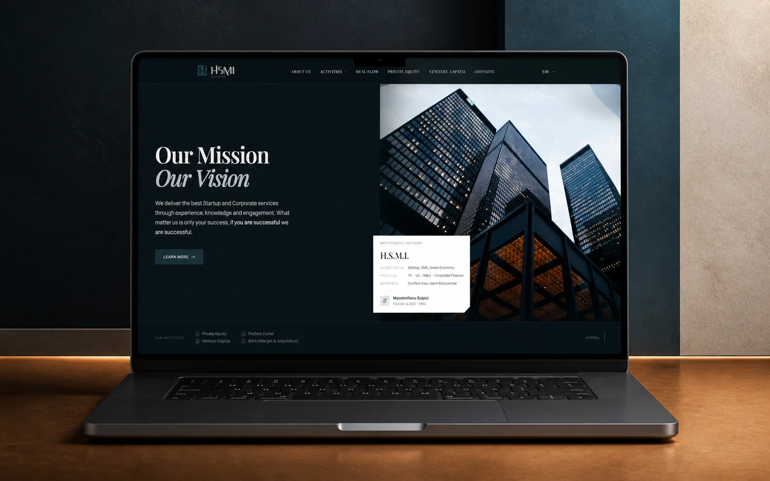
Case study at a glance
Problem
HSMI operates in venture capital and investment, where clarity and trust shape every first impression. Its old website felt dated, crowded, and disconnected from that responsibility.
Colors, typography, hierarchy, and messaging did not work together as a professional brand system. The surface looked old, but the deeper issue was credibility.
Important information lived together without useful categorization. Visitors had to interpret dense pages instead of moving through clear subjects and purposeful next steps.
Challenge
Freedom with responsibility
I had the freedom to redesign the experience independently, but that also meant defining everything from scratch: the content structure, page categories, visual identity, message, forms, interface system, and final implementation.
The redesign brief
Without a reliable visual archive, the clearest evidence is the set of decisions that moved HSMI forward.
Brand perception
A restrained palette, disciplined typography, and more deliberate spacing replaced visual noise with the composure expected from an investment business.
Information structure
Related content moved into purposeful categories and dedicated pages, giving each subject enough space and making the wider site easier to scan.
Visitor pathways
Clearer messages, focused calls to action, and new forms turned long pages into journeys with an understandable next step.
Solution
I grouped related information, created clearer categories, and planned dedicated pages so visitors could understand where they were and what to explore next.
A new relationship between color, typography, spacing, and hierarchy gave HSMI a more composed and trustworthy presence without relying on financial-industry clichés.
I reshaped the message around clearer priorities and introduced purposeful forms and calls to action instead of leaving visitors inside long, undifferentiated pages.
The source content and design rules became durable project context, helping every new section stay aligned with the intended brand and experience.
AI-assisted workflow
AI accelerated the process, but the workflow was structured around source material, explicit design intent, and my own judgment.
01 · Extract
I scraped useful content and images from the existing website instead of rebuilding context from memory.
02 · Organize
I organized the source material into a document that made content available throughout the build.
03 · Direct
I defined research, structure, typography, color, components, and implementation intent before generating sections.
04 · Build
I designed, developed, reviewed, and refined each part against the documented direction.
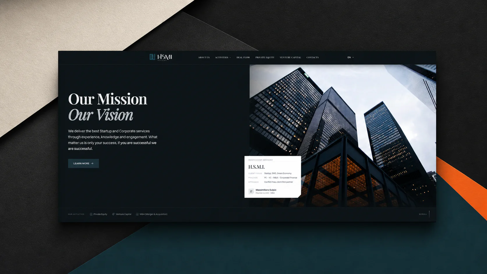
Delivery
Strategy into production
I developed the redesigned experience section by section, using the content and design documents as active constraints. Keeping strategy, interface design, and implementation connected protected the hierarchy, responsive behavior, forms, and brand tone through delivery.
Foundation
Structured content
Direction
Explicit design rules
Execution
Responsive build
hsmi.london
Open full websiteOutcome
HSMI now has a clearer structure, a more professional identity, and a website that communicates the trust expected from an investment business.
Stronger identity
Typography, color, hierarchy, and messaging now work as one system.
Clearer navigation
Categorized pages make dense information easier to understand and explore.
Reusable method
The project established a structured AI-assisted workflow for future builds.
Verified measurements will be added when they are available.
AI became most useful after I made the content, design intent, and standards explicit.
This project tested more than a new toolset. It tested my ability to direct a complete transformation independently, use AI without giving up design judgment, and carry every decision into the finished website.
Next case study
Have a product in mind?