Stage 01
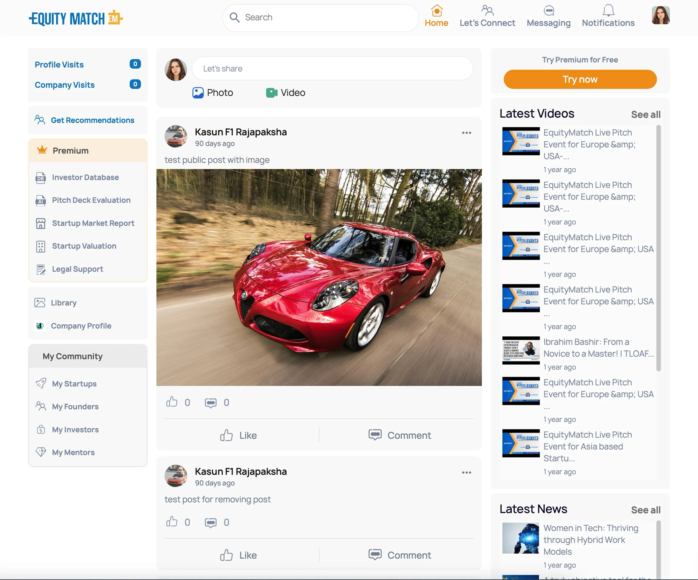
Existing UI
Familiar structure and behaviors, but an outdated and inconsistent visual layer.
EquityMatch · Product transformation
A gradual interface transformation using transition UI, atomic design, and frontend implementation.
Role
UX Engineer
Project
EquityMatch
Contribution
UI/UX + Frontend
Status
Ongoing product

Problem
EquityMatch already had a working platform and an engaged user base. Its interface, however, felt outdated and visually inconsistent.
I joined as a UX Engineer specifically to improve that UI. My responsibility covered both interface design and frontend implementation.
A stronger interface could improve clarity, consistency, and trust. But because the product was already in use, the redesign could not begin from a blank slate.
Challenge
Improve without disrupting
The risk was user disruption. Releasing a completely different interface in one step could overwhelm people who already understood the existing product. The experience had to improve visibly while remaining familiar enough to use confidently.
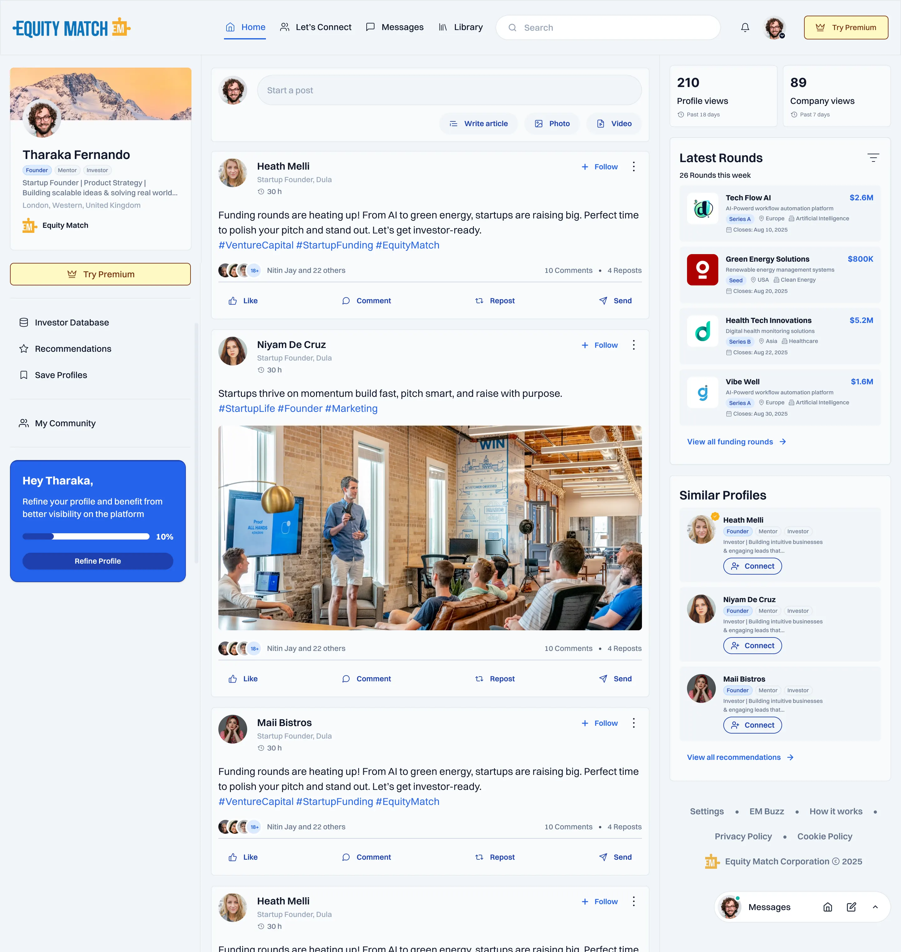
Start with the contrast
Solution
I knew this could not be a unique problem. I researched how established products introduce major interface changes and used AI to widen the search, compare approaches, and identify a method that suited our situation.
The transition UI became an intentional middle state between the old product and the full redesign. It introduced changes that were visually meaningful but structurally safe, giving users time to adjust.
I started with the home feed, then expanded the new foundation across other pages. Each step improved the product while preserving enough familiarity for active users.
Stage 01
Familiar structure and behaviors, but an outdated and inconsistent visual layer.
Stage 02
Updated color, typography, roundness, and global components while keeping major patterns recognizable.
Stage 03
A stronger system expanded gradually across the feed and the rest of the product.
Delivery
From interface to system
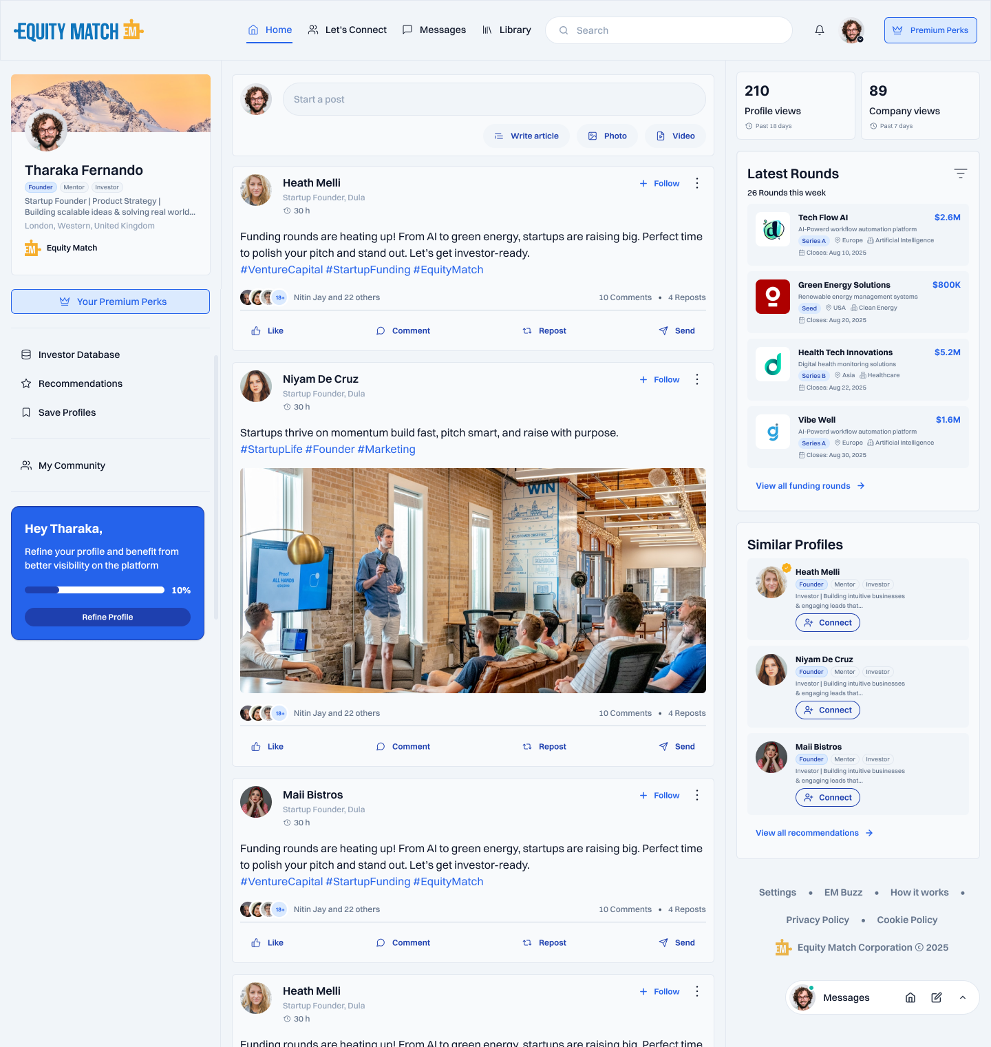
The home feed gave us a high-value place to test the transition, improve the visual hierarchy, and establish reusable patterns for the product.
I used atomic design to organize foundations, small UI elements, connected components, and complete page patterns into one evolving system.
Because I designed the UI and worked on the frontend, the system could move directly from Figma into production with fewer translation gaps.
Once the transition worked on the feed, the same foundations and components supported gradual improvements across other pages.
Product expansion
A shared visual language across the wider platform.
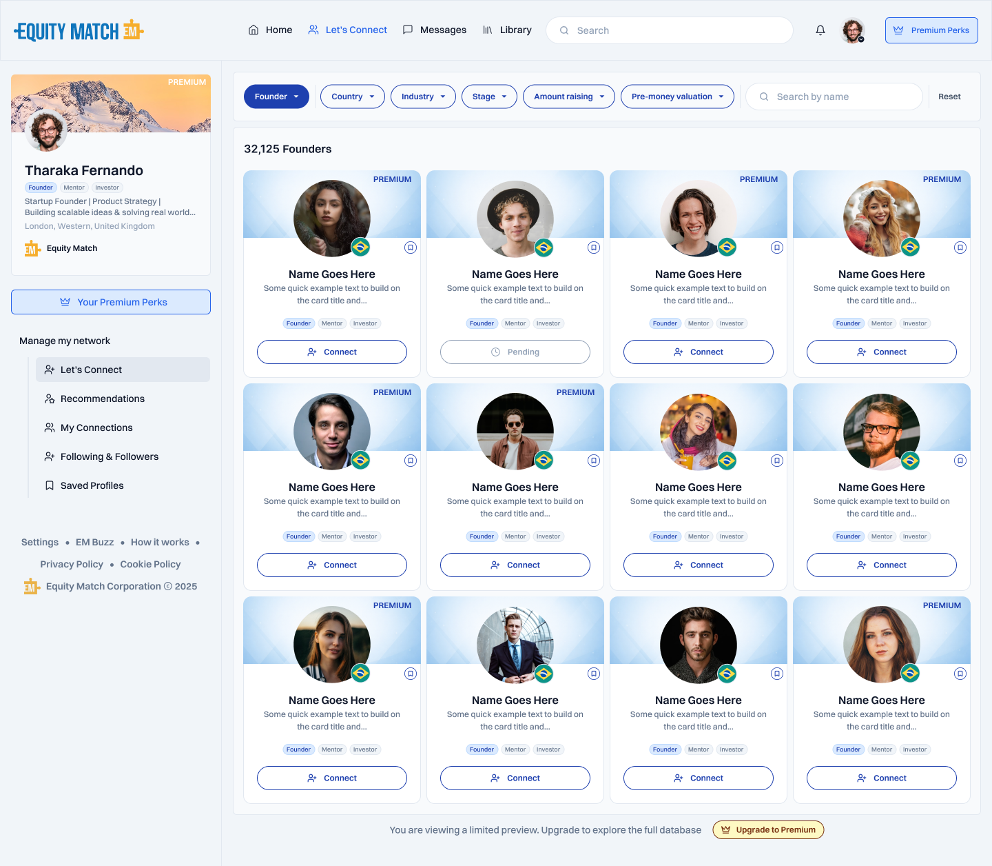
The same visual foundation extended across discovery, notifications, and profile experiences, keeping each page familiar while giving the product a clearer shared language.
01 · Home feed
02 · Let’s Connect
03 · Notifications
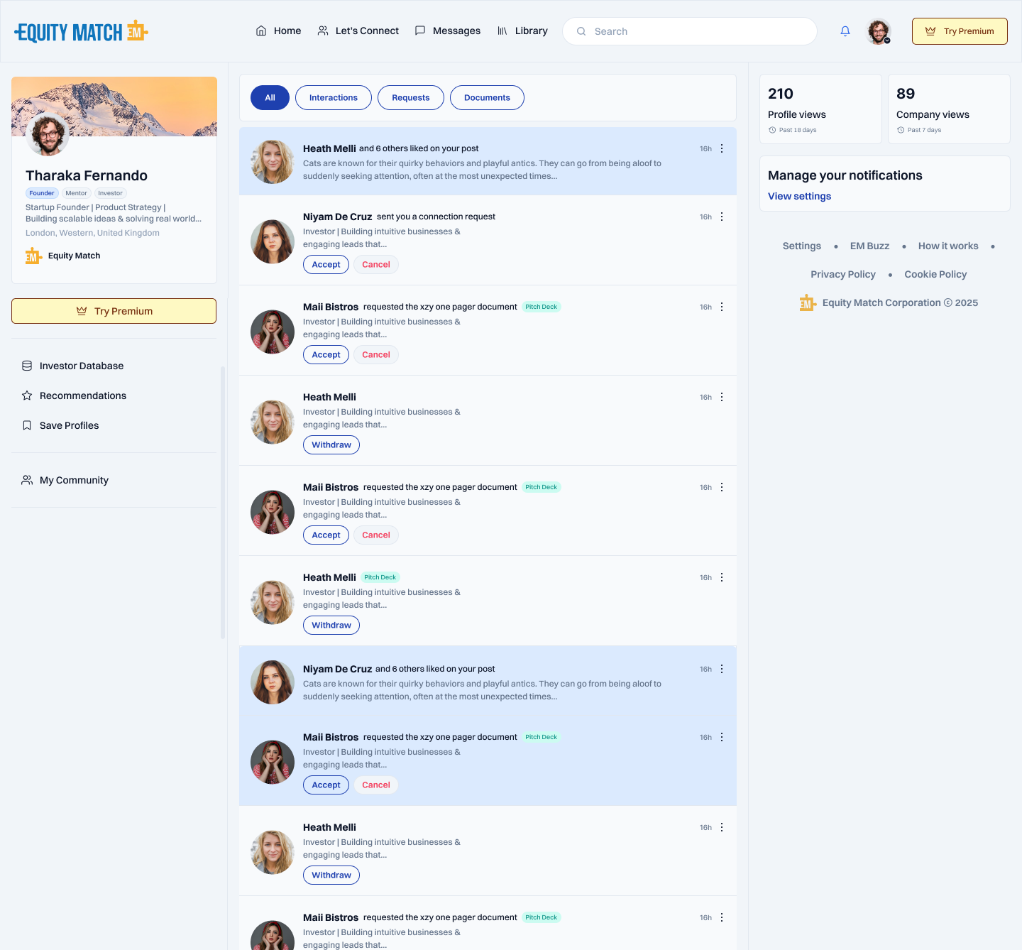
04 · User profile
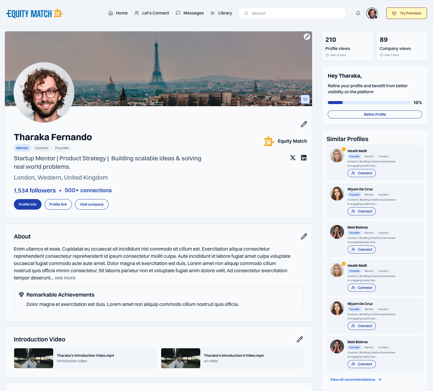
Outcome
The transition worked, and it gave EquityMatch a practical way to keep improving the product after the first release.
Gradual rollout
The visual change arrived in controlled stages rather than one disruptive redesign.
Reusable foundation
Components and atomic structure supported continued work across the platform.
Expanded responsibility
My role grew from UX engineering toward product design and product engineering.
Quantitative product metrics will be added only after they are confirmed.
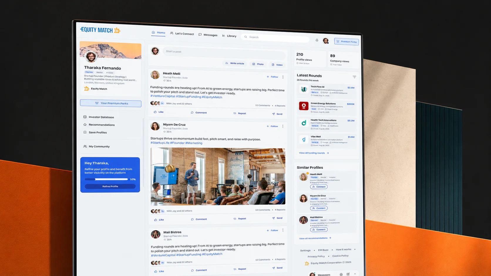
The most important design was not the old interface or the final one. It was the bridge between them.
This project changed how I think about redesigns. A strong product designer has to design the transition itself: what changes now, what stays familiar, and how each release prepares users for the next one.
Next case study
Have a product in mind?