Carry the visual identity across
Typography, color, iconography, and familiar interaction cues keep the app visibly connected to the EquityMatch web platform.
EquityMatch · Mobile app
I designed the initial mobile experience so EquityMatch users could move from web to app without losing the product they already knew.
Role
Product Designer
Scope
Mobile product design · UI
Initial areas
Feed · Profile · Posts · Notifications · Let’s Connect
Status
Initial release
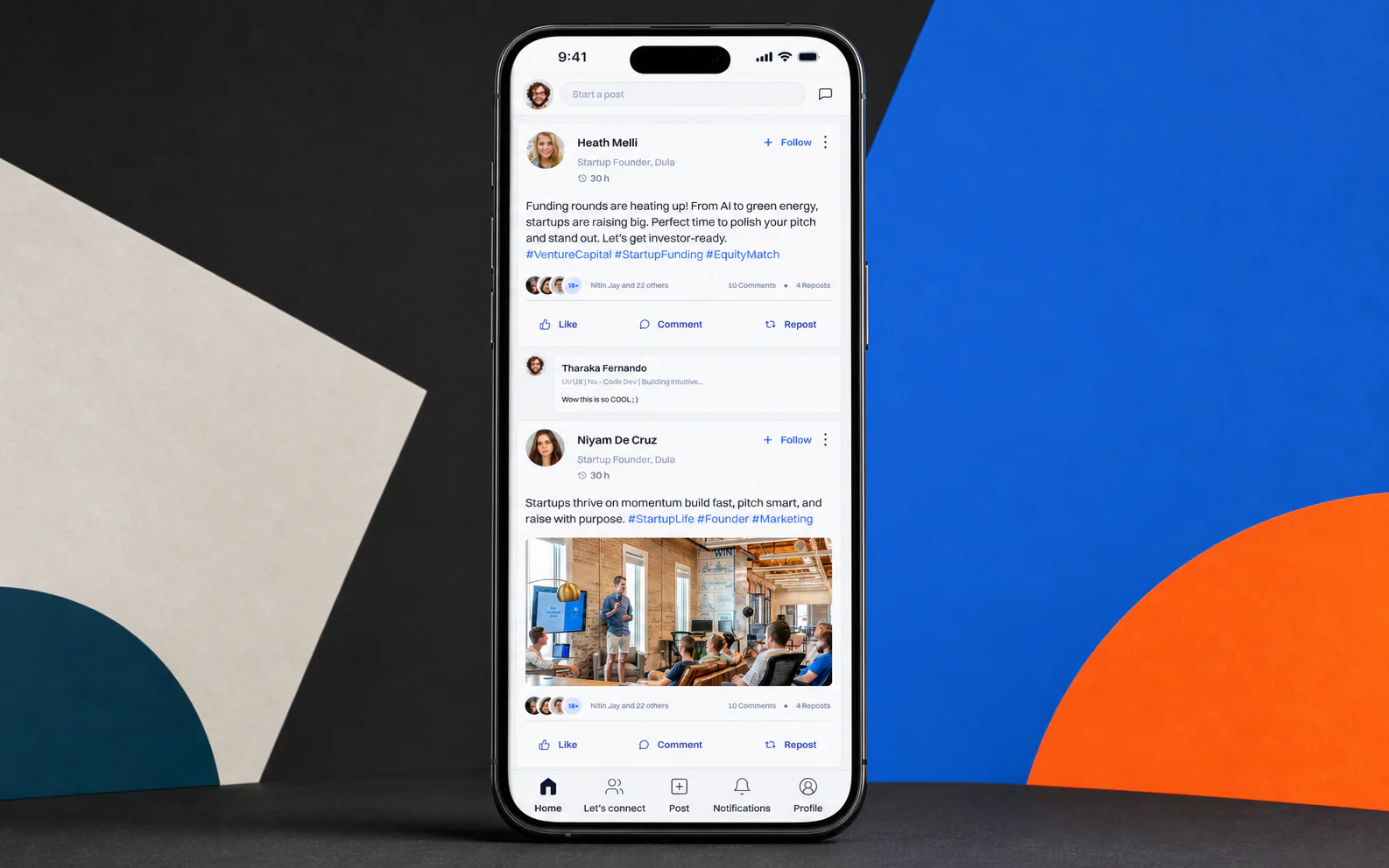
Case study at a glance
Problem
EquityMatch brings investors, founders, and professionals together. Its most important networking activities needed to become available in a mobile context without feeling like a separate product.
A direct reduction of the web interface would weaken hierarchy, readability, and interaction. Mobile needed clearer priorities and more focused journeys.
At the same time, changing every familiar pattern would create unnecessary distance for people already comfortable with EquityMatch on the web.
Challenge
Familiar, not copied
I reviewed the existing EquityMatch web platform and comparable mobile products to understand which patterns should remain recognizable and which needed to change. The app had to feel professional, focused, and unmistakably connected to the product users already knew.
Solution
Typography, color, iconography, and familiar interaction cues keep the app visibly connected to the EquityMatch web platform.
New navigation, cards, controls, spacing, and content density respond to portrait screens instead of compressing desktop components.
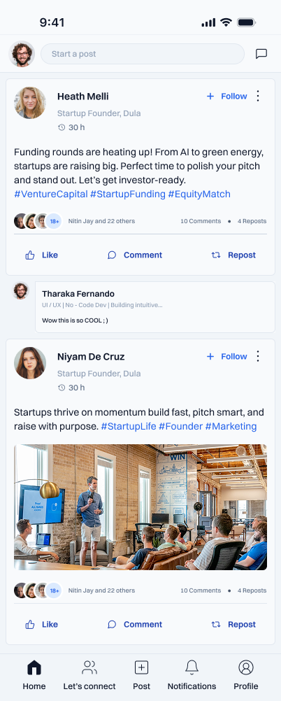
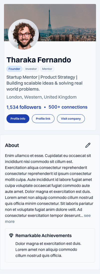
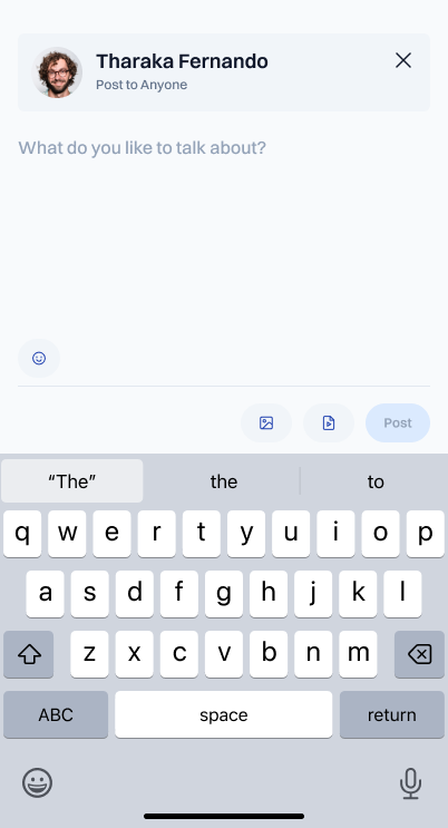
The initial release centers the feed, profiles, posts, notifications, and connection flow so the product’s networking purpose remains clear.
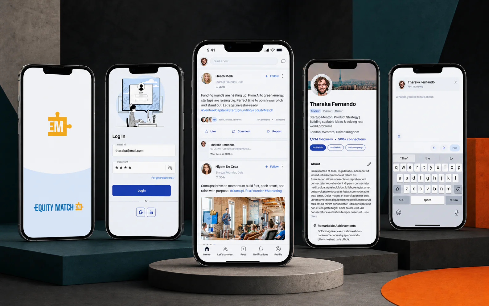
Initial-release screens
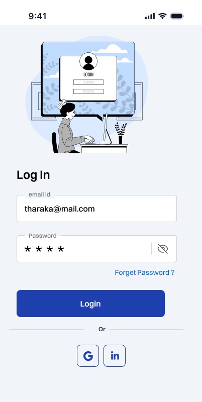
Five key touchpoints show how the experience moves from first launch and sign-in to the product’s core social journeys.

Delivery
Design ready for implementation
My role covered product thinking, interface design, reusable component decisions, consistency review, and developer handoff. I organized the screens around shared mobile patterns so implementation could extend the experience without changing its visual logic.
Foundation
Existing design system
Adaptation
Mobile components
Handoff
Consistent specifications
Outcome
The initial release gives the platform a coherent mobile expression while preserving the professional character and familiarity of the web product.
Familiar foundation
Existing users can recognize the product’s identity and interaction language.
Mobile clarity
Focused layouts make core networking journeys easier to scan and use.
Room to grow
Reusable components create a practical base for future mobile features.
Cross-platform consistency is not copying a layout. It is preserving what users recognize while designing for a new context.
This project strengthened how I think about continuity across devices. The design system provided the shared language, while mobile constraints helped me decide what needed to become simpler, closer, and more immediate.
Next case study
Have a product in mind?