Find where the page lost clarity
I reviewed the content hierarchy, section order, visual inconsistencies, and competing calls to action. This separated surface problems from the structural decisions affecting comprehension.
EquityMatch · Landing page redesign
I reshaped the experience from research and UX strategy through Figma, React, and Tailwind CSS.
View live websiteRole
Product Designer + Developer
Tools
Figma · React · Tailwind
Project
EquityMatch landing page
Live site
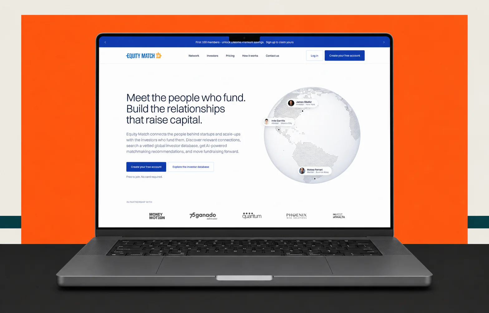
Case study at a glance
Problem
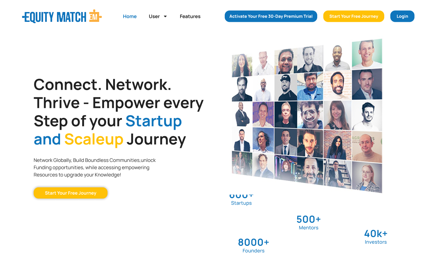
The existing WordPress landing page had inconsistent layouts, weak hierarchy, and a yellow visual direction that felt disconnected from EquityMatch and the venture-capital industry.
Visitors had to work too hard to understand the platform, who it served, and why they should continue. Calls to action competed instead of creating one clear journey.
The issue was larger than color. Content order, visual rhythm, trust signals, and interaction all needed to work together as one conversion system.
Challenge
Trust before persuasion
The page needed to communicate a professional funding network, explain the value for investors and founders, and make the next action obvious. It also had to feel like the public entrance to the same product, not a disconnected marketing layer.
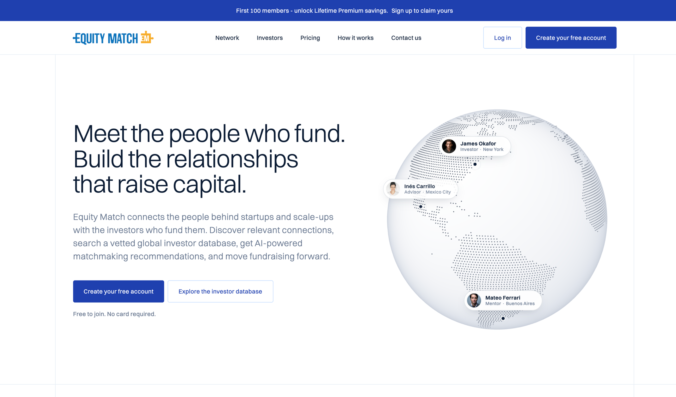
Before and after
Both pages use the same frame and top-aligned crop, making the change in hierarchy, density, color, and calls to action easy to evaluate.
Solution
I reviewed the content hierarchy, section order, visual inconsistencies, and competing calls to action. This separated surface problems from the structural decisions affecting comprehension.
LinkedIn and AngelList helped frame the expectations of a professional network. Stripe showed how a rigorous design system can make complex technology feel established, clear, and trustworthy.
I rewrote the visual hierarchy around a clear promise, supporting proof, product explanation, and deliberate calls to action. A blue direction strengthened trust while connecting the page to the platform and its industry.
Wireframes established the narrative and conversion flow. High-fidelity UI, responsive states, reusable patterns, and a working prototype then made the intended experience testable before development.
Delivery
Figma to frontend
I built the responsive landing page with React and Tailwind CSS. Owning both the design and frontend meant the hierarchy, spacing, responsive behavior, and interaction details did not disappear during handoff.
Structure
Reusable React sections
System
Tailwind design tokens
Quality
Responsive refinement
Outcome
The chairman and stakeholders approved a direction that felt more credible, more engaging, and more aligned with EquityMatch and its industry.
Stronger alignment
The marketing page and product now shared a clearer visual character.
Clearer journey
Content and calls to action worked together instead of competing.
Stakeholder confidence
The final direction earned approval from the chairman and wider stakeholders.
Live final experience
The shipped website is embedded below at a smaller scale. Scroll and interact with it without leaving the case study.
equitymatch.co
Open full websiteA landing-page redesign is not a color exercise. Trust, information order, calls to action, and implementation quality have to work as one system.
This project reinforced why I keep design and engineering connected. The strongest concept only matters when the shipped experience preserves the decisions behind it.
Related case study
Have a product in mind?